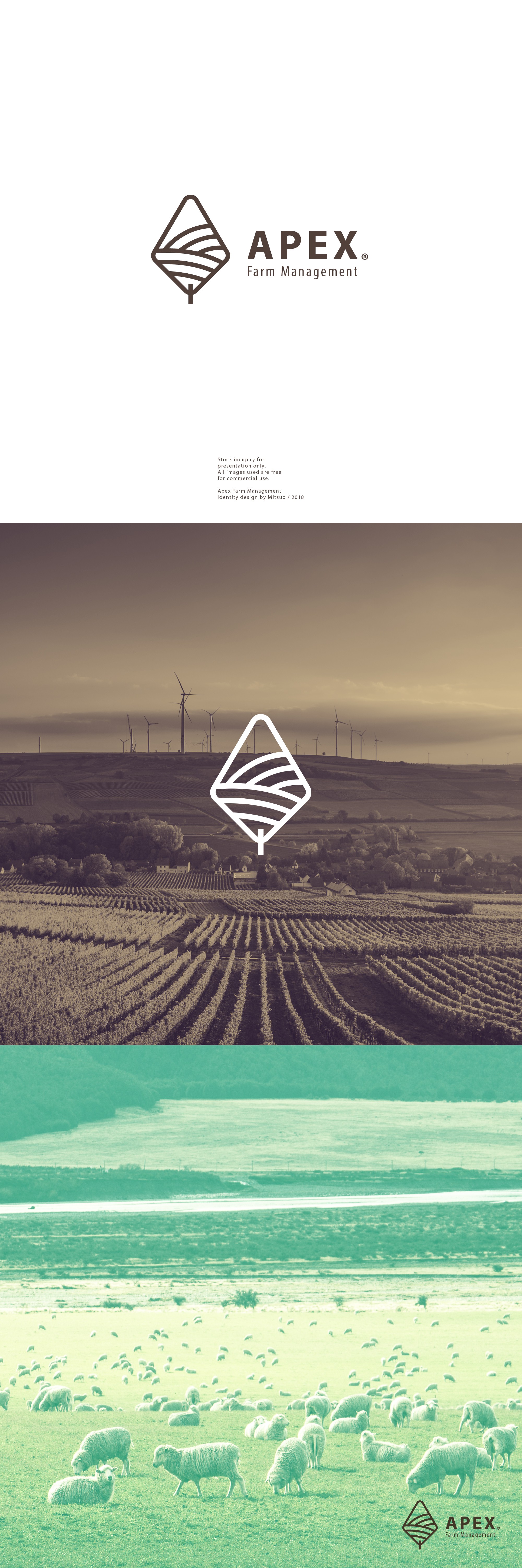

The Apex logo is pretty straight forward. This is a company that manages investments towards farms, landowners and investors. As they say "We are a company that manages investment farm ground for landowners and investors. So the landowner buys the ground and we handle all of the revenue producing activities that happen on the ground."
In my design you can see a lineart type of logo with some fancy combinations behind. For this concept i mixed the letter A from the company's name, with LANDS - as you can see the curved lines inside, in a LEAF shape - all about nature. To contrast with this soft emblem, i chose a solid reliable font with two different weights.
Ended up pretty happy with the resultant design, but i can't say about the client. The contest got locked with no feedback alsoever :(