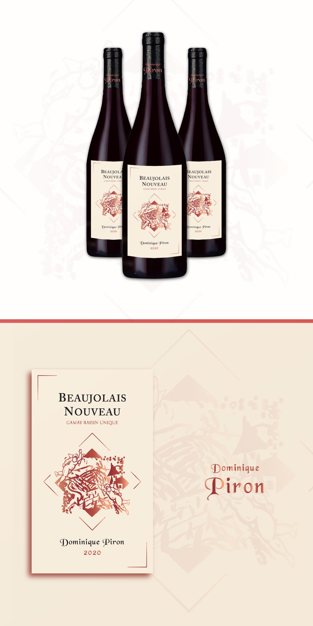

I chose to create a portrait layout of the label in order to keep it more clean and clear, without cluttering the details on the label.
This way, the client can change or add any other details he may need for the front label.
The colors of the label: since client mentioned the “Feuille Morte”, I’ve used autumn related color palette, in this case a “Linen” color for the background, combined with the red metallic copper for the main drawing, and also for some parts of the text, contrasting with the dark grey of the wine name and company / domain.
To keep coherence of the overall bottle look, I’ve added the name of the company in the same metallic copper color for the neck of the bottle.
The rhomboid shape is meant to create connection between the elements, pointing to both top and bottom of the label (product name and company name).
These colors reflect both minimalism and heritage styles.