Young women lingerie and apparel logo design – contest entry

0
Created on 99designs by Vista
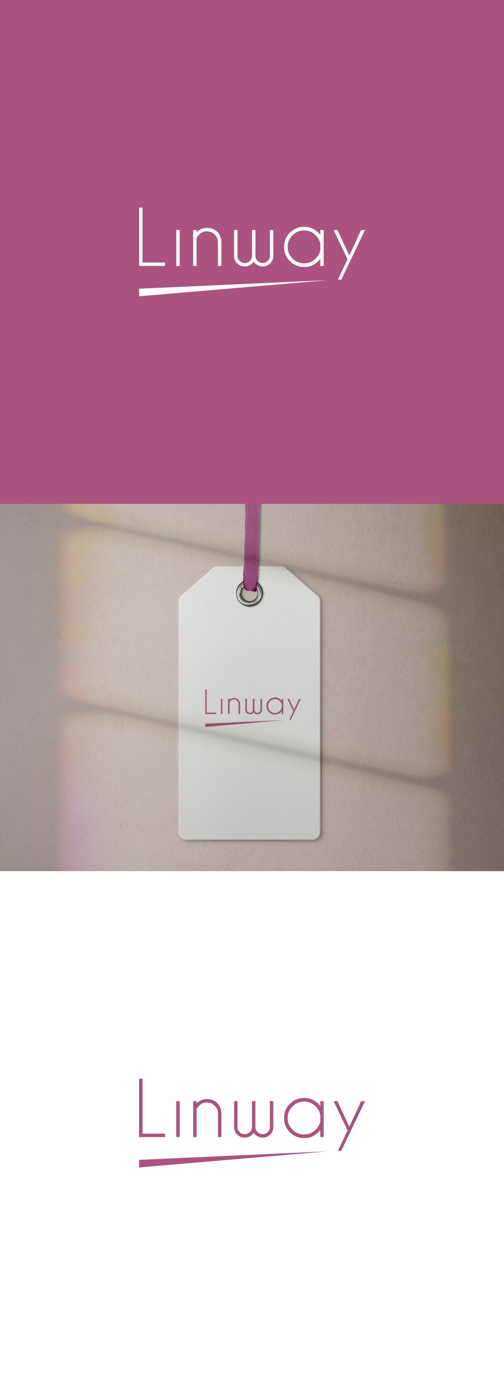
I chose to use a thin font style to give that delicate, feminine youthful feeling, but at the same time adding sharpness and confidence by using the arrow-like shape, related to the “way” part from the brand name. Also, it is both economical and luxurious, geometric and organic.