Christian Attorneys

61
Created on 99designs by Vista
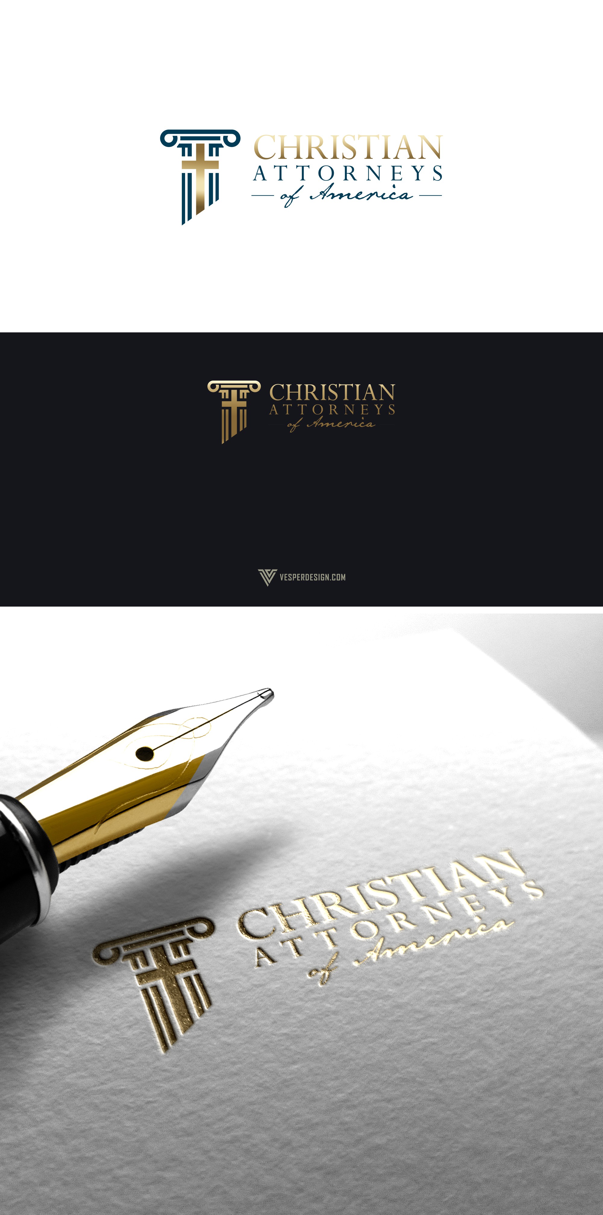
Entered this contest with a couple of concepts that involved double entendres. I felt that using the columns or pillars were emblematic of the Church as the Bible describes the entity as the Pillar of the Truth. Then to clearly integrate the cross was a concept that became apparent after several iterations and tests.
Typography was a work in progress but we finally landed on something sophisticated and organic. I wanted to represent the typeface for America in a Declaration of independence typescript to give it that American feel.
Overall this concept was chosen for the winning design.