Created on 99designs by Vista
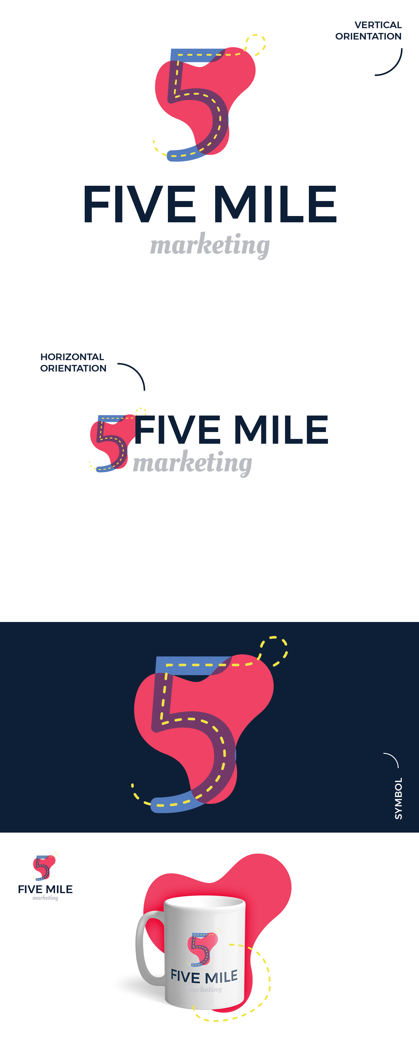
The client needed a bold logo that would eventually incorporate the 3 company colors: red, blue, yellow. Besides using those colors, I have also made use of the "5 miles" part of the name and made a symbol representing the road itself.
I worked the logo so it would work on both dark and light background and with a vertical and horizontal orientation (so it could easily be integrated on a website).
