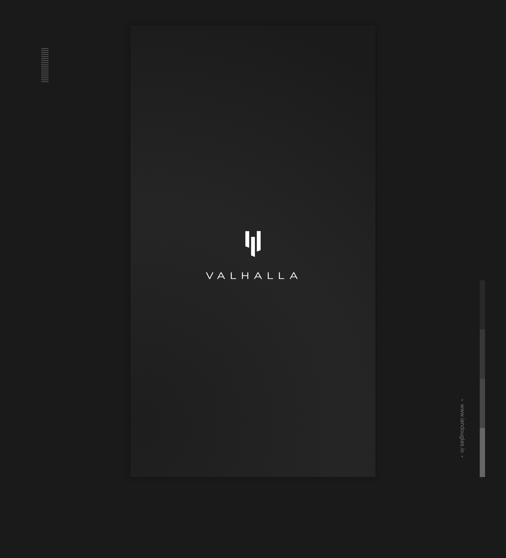
Minimalist mark for Viking-themed male skin care brand

36
Created on 99designs by Vista
The client was seeking a firmly masculine, Viking-based brand mark. I wanted to get far away from anything literal. So I made an angular, non-geometrical mark. I wanted to convey characteristics, not facial or sartorial features. And in the most simple way possible. It is intended that the lower half be the bridge of a nose. Angled, in negative space, the eyes. Overall, a V for Valhalla. The expressiveness is borne only of angles, and concerns what is quintessentially Viking. Irregular. Forceful. Ominous. Battle-hardened.