
Created on 99designs by Vista
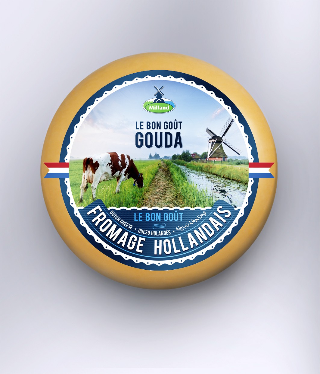
Carefully reading what the client wants in the brief, I've bravely used an image instead of vectors as 95% of the other designers did. Adding some elements that symbolize Holland and Dutch culture it gave pretty nice balance and contrast of the elements in the label.