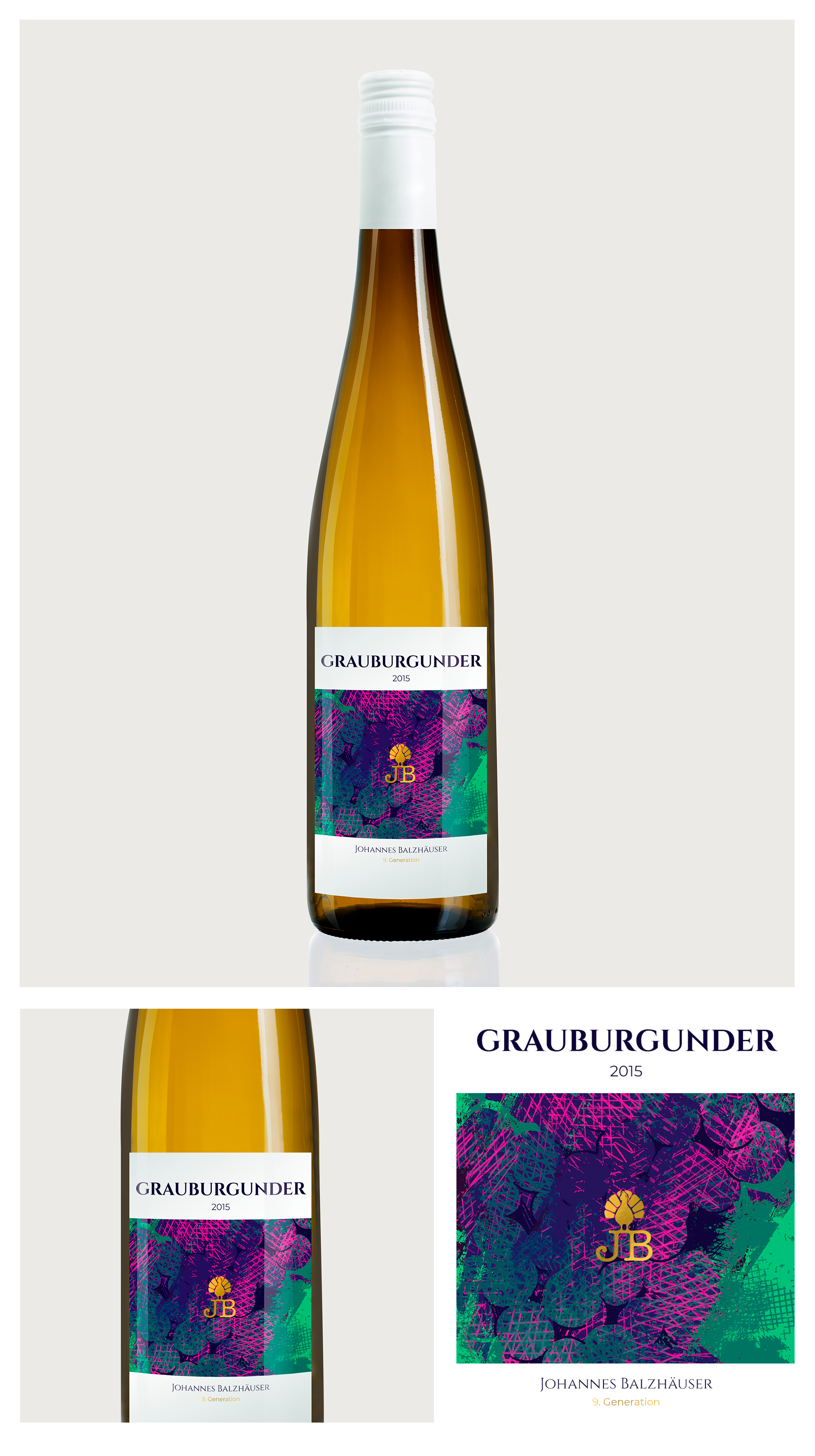
Concept for Wine Label
1
Created on 99designs by Vista
The main idea of this packing concept is to show to customers the main points from the philosophy of the brand - personality and style. I've created the illustration to make label wine more unique. The illustration a little abstract to associate with joy. At first, you see some brush strokes like modern art but if you look closer you can see the shape of the grape. As a metaphor when the wine is revealed. I use colors of grape to highlight the organic of the product. It can highlight the wine among competitors, interests the buyer, and establish trust with clients.
