
Created on 99designs by Vista
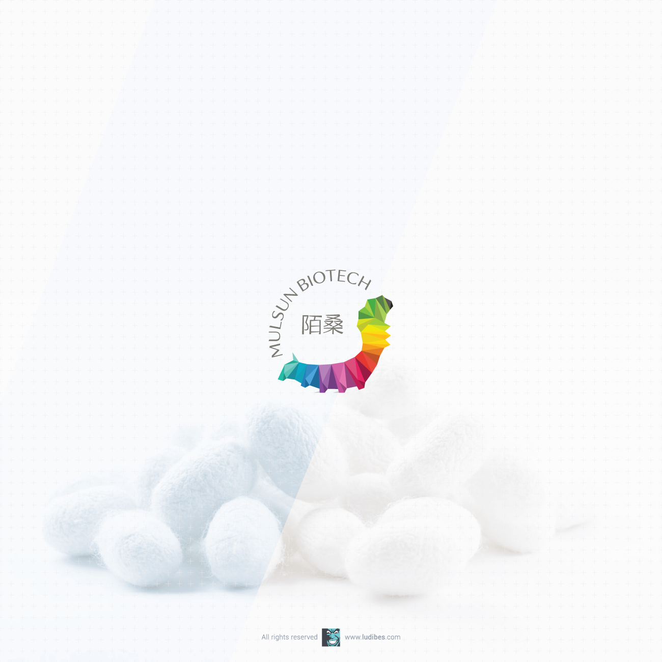
Silkworm rearing company aproached me for redesign of their logo, which they liked except it was wrong spieces of worm depicted. So, this project was all about meeting client wishes and keeping the same multicolor triangle design while showing anatomical features true to silkwworms. It took over 20 revisions, 50 shades of color and 60 triangles to reach the solution client was happy with. Paired with customised english and chinese lettering this abstract and geometric design is not among my favourites but its worth showing for painstaking journey to get it done.