Created on 99designs by Vista
The client needed a bold font that targets everyday customers. Their product delivers tasty locally produced home cooked meals to customers. Most of their customers are females in their 30s and 40s.
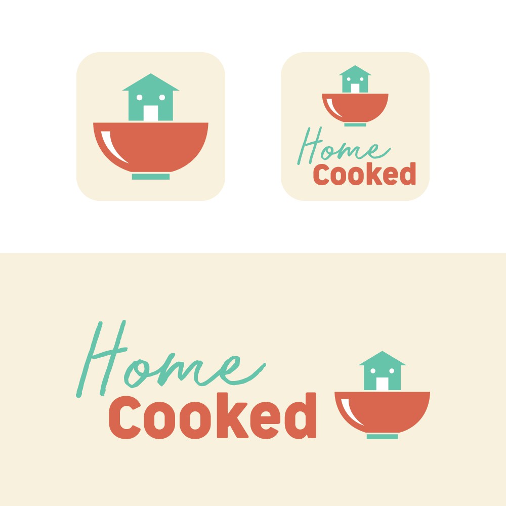
The client would also like to have a logo that could work as an icon for iOS app.
The fonts represents the brand, a modern concept with a human touch. The combination of fonts and colours gives an approachable and trustworthy tone of voice.
The icon is a quirky yet professional concept. A house inside a bowl gives the literal meaning of 'home cooked'. Also, the house looks like an arrow pointing upwards, an emphasis on the positive and warm effect to a person after eating a home cooked meal.
