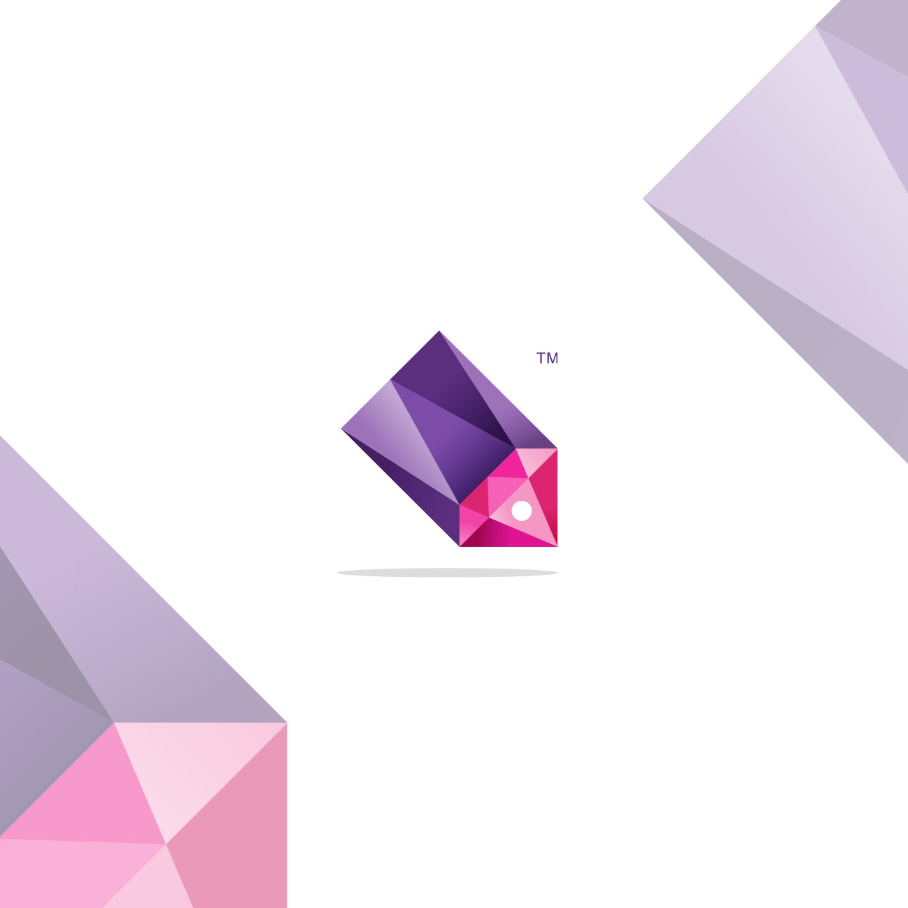

I wanted to create visual pun by integrating two aspects of company name into one cleverly executed symbol hence why I used diamond and price tag.
I used diamond as focal point of this design keeping it integrated into and forming discount/price tag.
Naturally diamonds are quite angular so I followed this premise and integrated network/sharing/community sort of look keeping that crystal reflecting, facet, tesselation effect trough whole tag instead of having it only on diamond jewel. It gives nice dimension to the symbol so it doesnt look flat but instead stand from the background.
I used Red-Pink-Coral combination of colors to evoke passion, sensitivity, desire and Purple tones to bring some elegance, extravagance and Independence and to tie symbol closely to target audience.
All in all great cooperation with my client and awesome end result on which both of us are proud.