Created on 99designs by Vista
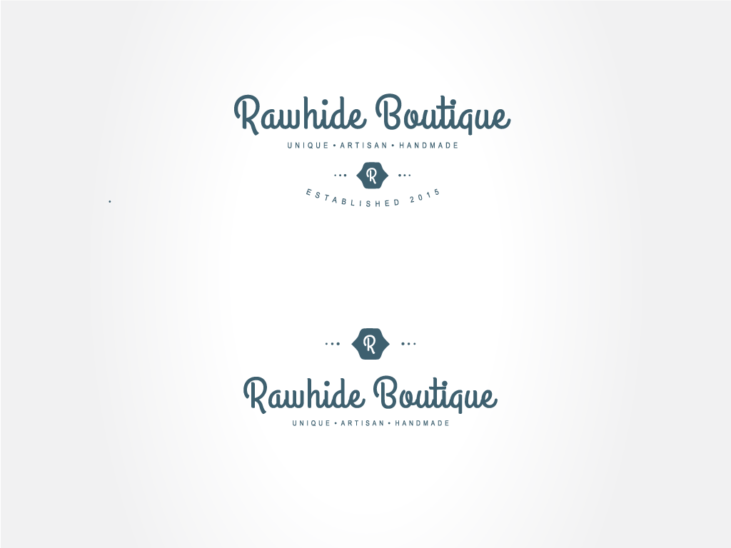
My design process was to show the less is more approach. The logo was to be used in numerous techniques, such as embossing, printing, store advertisements, etc. so having a creative font and unique placement was key for me. I also wanted to give the logo an identifying mark. ( R ) I took the letter R from rawhide and placed it into a western style shape with diminishing circles to both the left and right sides. I chose this style to be not only cohesive with the brand but be able to make it recognizable by itself. I also wanted the logo to be able to adjust to different products, thus the two different arrangements of the logo.
