Logo for healthy food restaurant

0
Created on 99designs by Vista
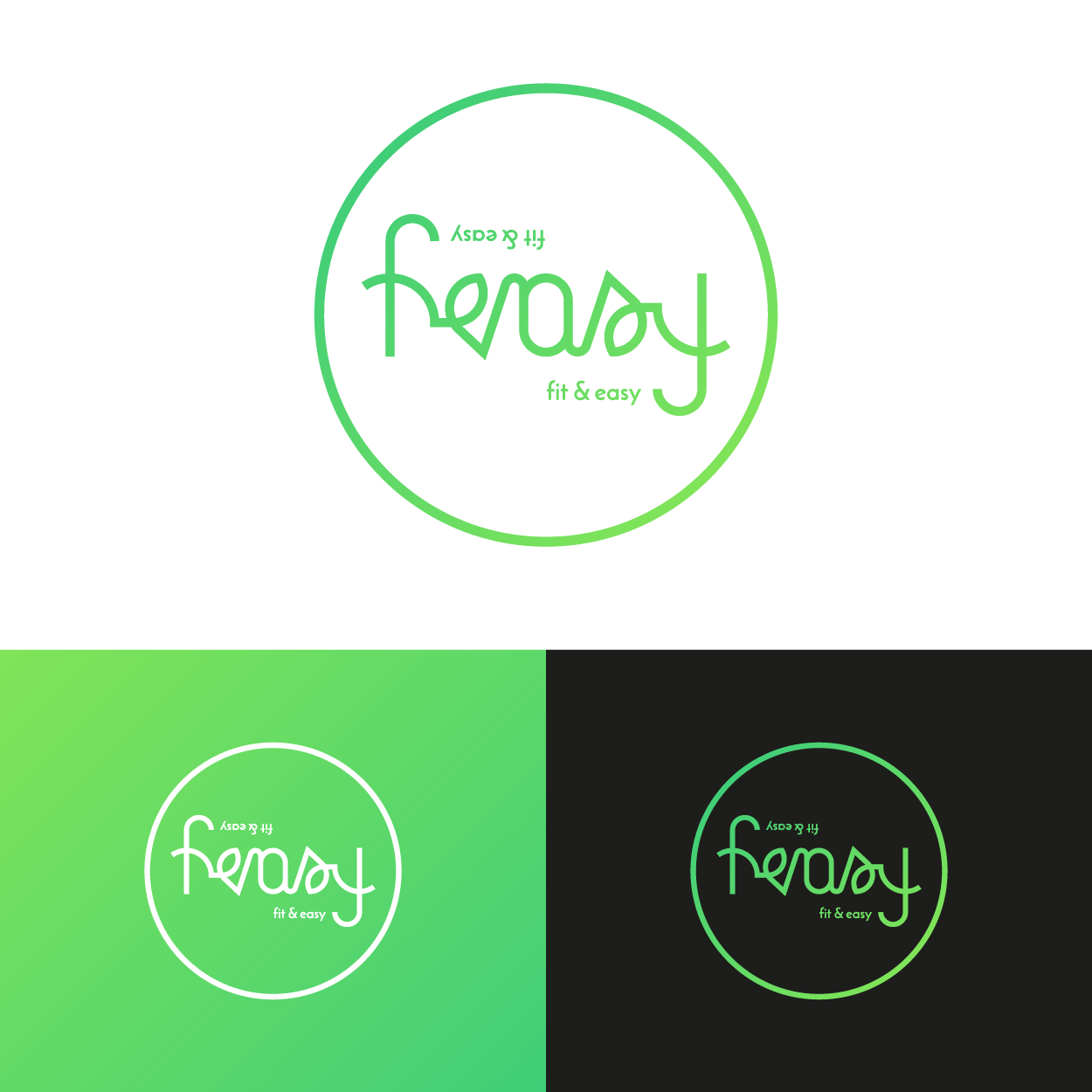
The logo is an ambigram - looks the same upside down. I believe this is a nice twist, because people can relate to it and it's memorable. The color is light and fresh, works nicely as a background and looks great and popping on black.