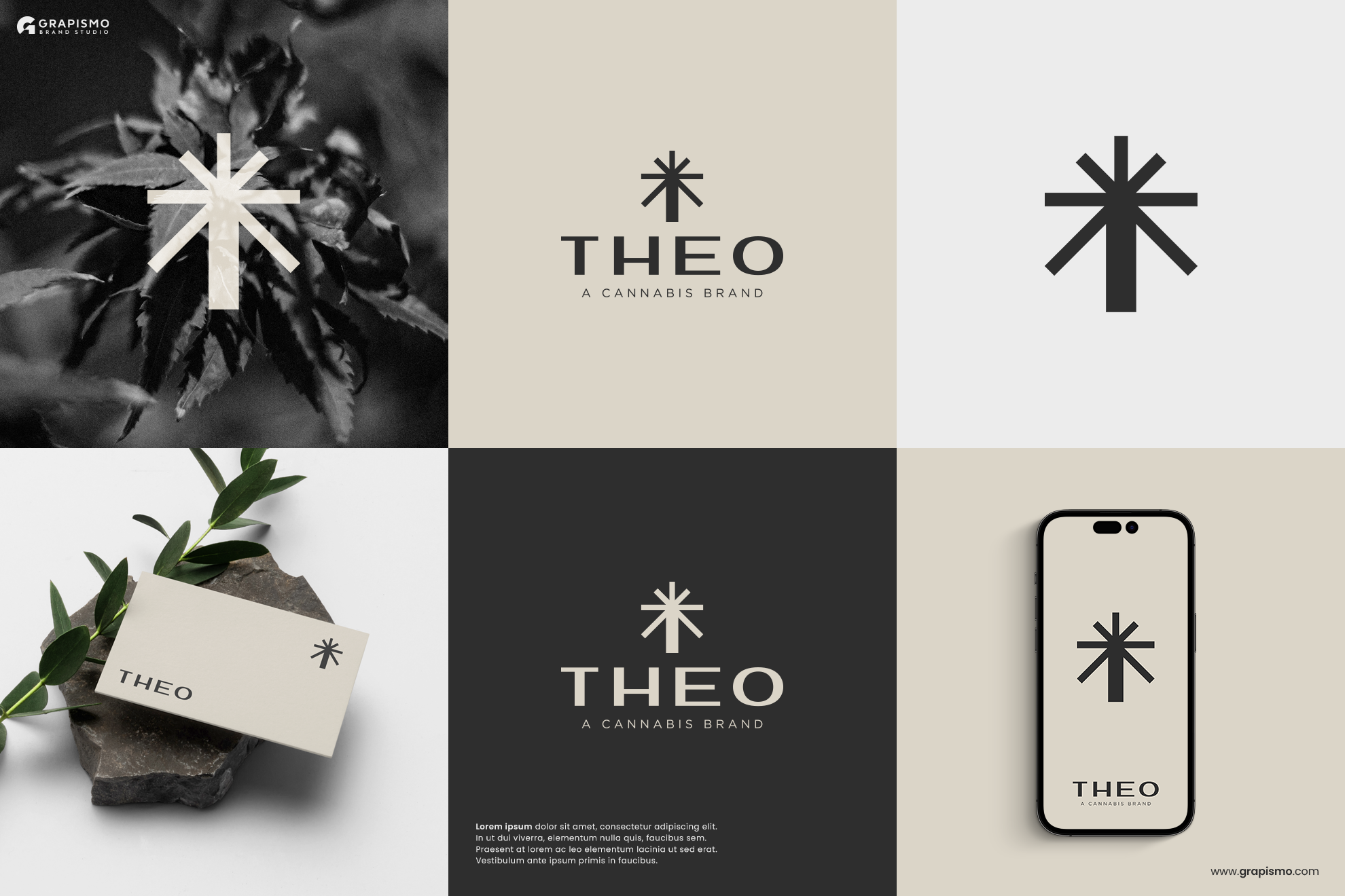
Modern and Geometric Logo for a Cannabis Brand, THEO

5
Created on 99designs by Vista
The logomark is an abstract and geometric representation of cannabis. I made it upside-down to make it look like the letter T of the logotype THEO, that way, it will be recognizable as the brandmark of THEO.