Created on 99designs by Vista
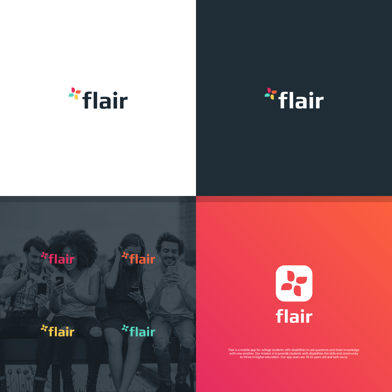
The logo uses 4 abstract shapes to create a form that represents meeting, support, community and learning, communication with each other. At the same time it represents a whirlpool as a synonym for movement, joy, advancement and cycle. The colors convey the diversity of the students.
