Geometric Modern logo for Living Matrix CBD and cannabis oil

95
Created on 99designs by Vista
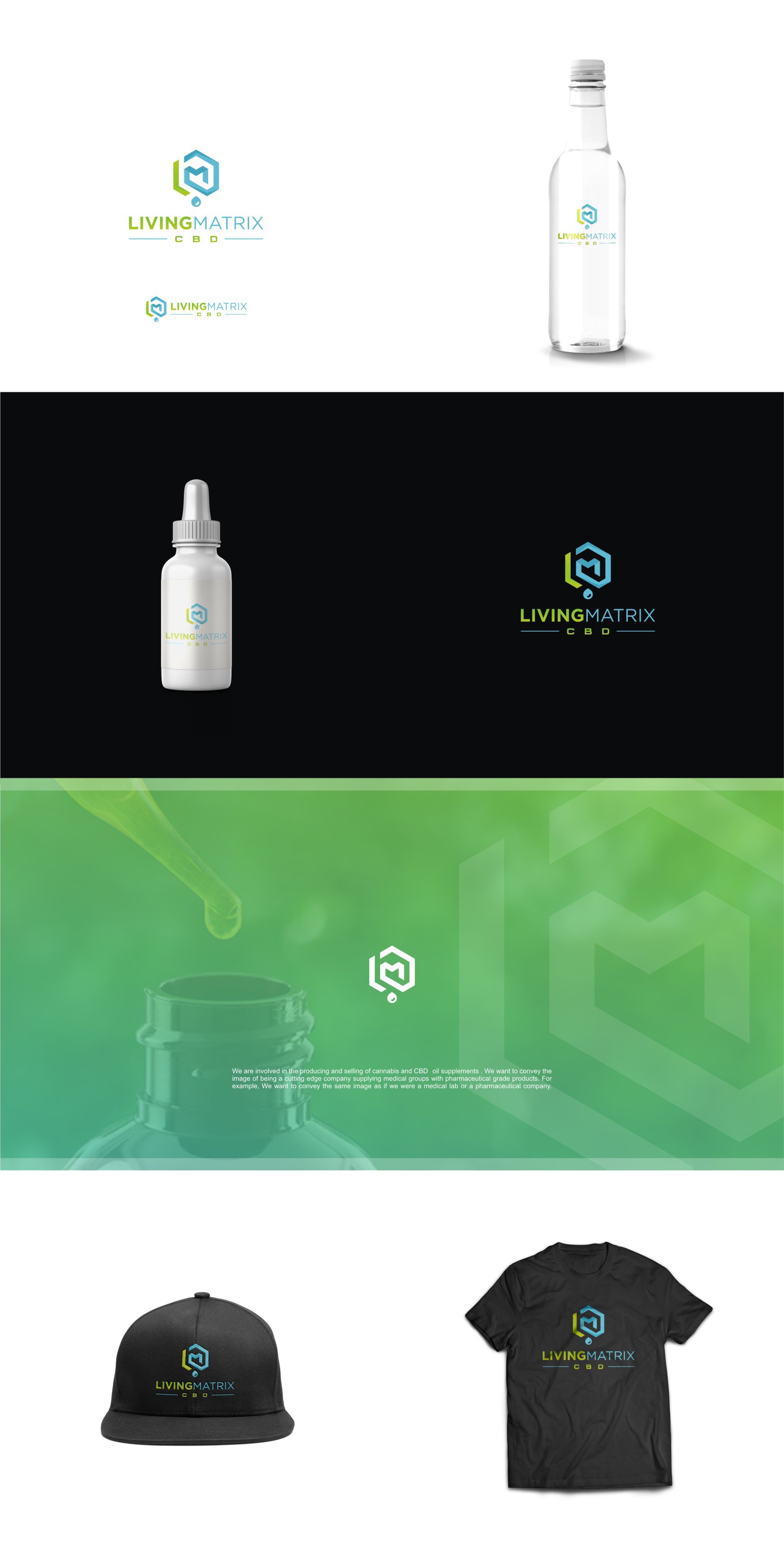
Client demanded something unique, geometric and to steer away from the stereotipic cannabis industry imagery. I used a hexagonal shape (a refrence to CBD and THC molecule) to integrate companys intials crating also a kind of a matrix inside. Client also requested the small droplet to personalise it even more. Result is great!