
Created on 99designs by Vista
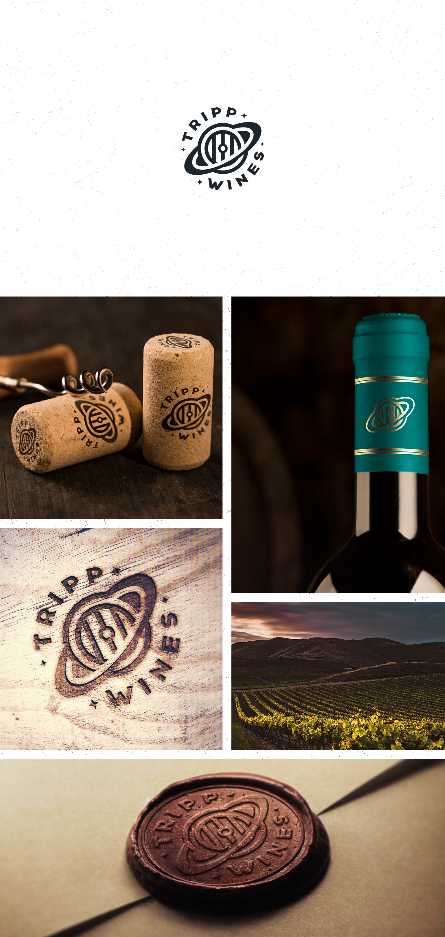
The client was opened to an abstract approach toward logo, something that can play the "Tripp" name and the possibility to combine a space theme with the wine.
My idea was to make a combination or a blend of Saturn and the wine barrel with the use of clean geometry, simplicity, and negative space and to create a memorable and versatile mark.