Created on 99designs by Vista
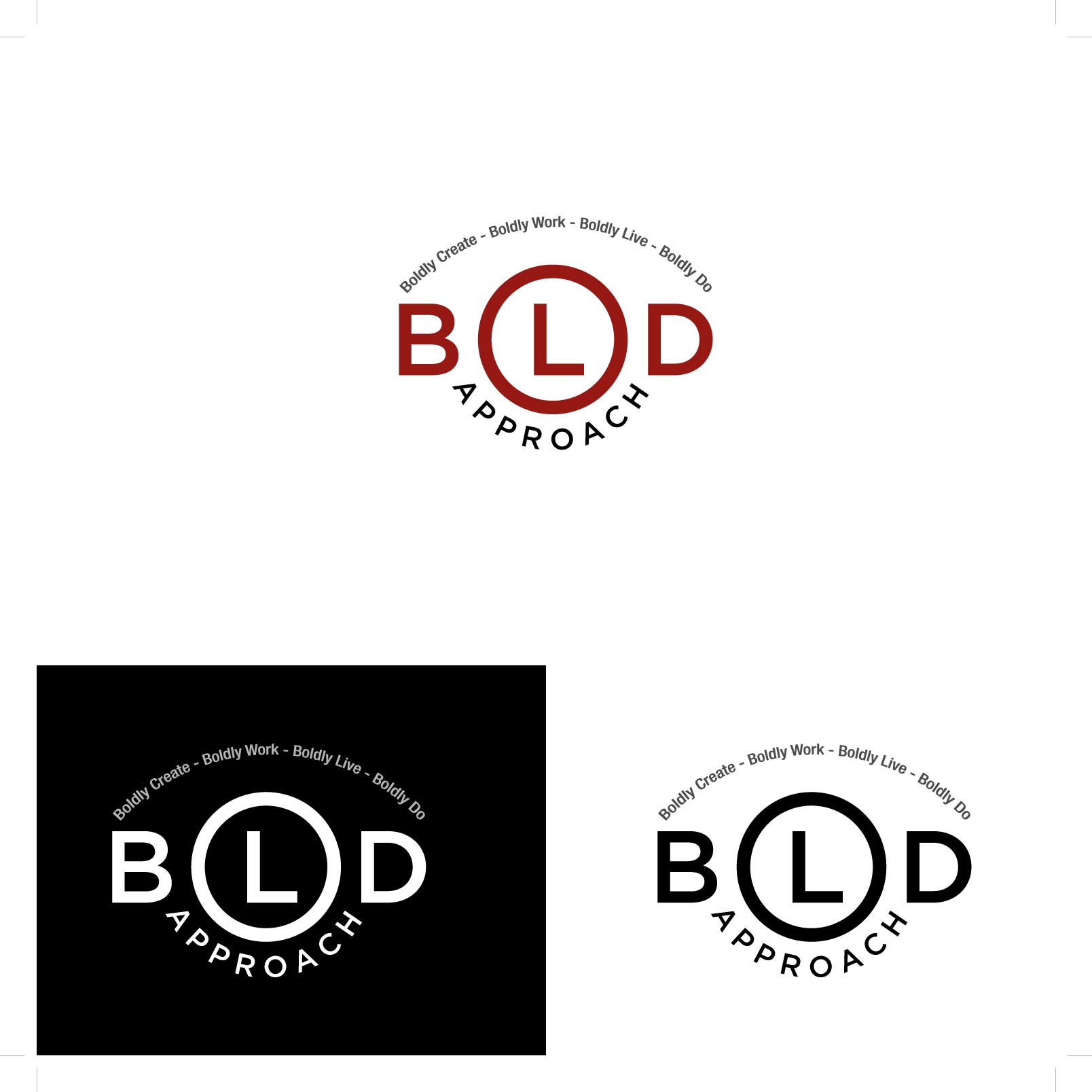
Client requirement 'Redesign My Logo And Make It Bold and Badass!' Not following the usual convention of the 'BA' or 'B' monogram I explored the possibility of placing the letter 'L' inside the 'O' and felt it works and on first seeing the word mark you stop and think and then realise /realize it reads 'BOLD'.
The slogan on a curved path implies a roundel form for the brand.
BOLD and Badass.
