
Created on 99designs by Vista
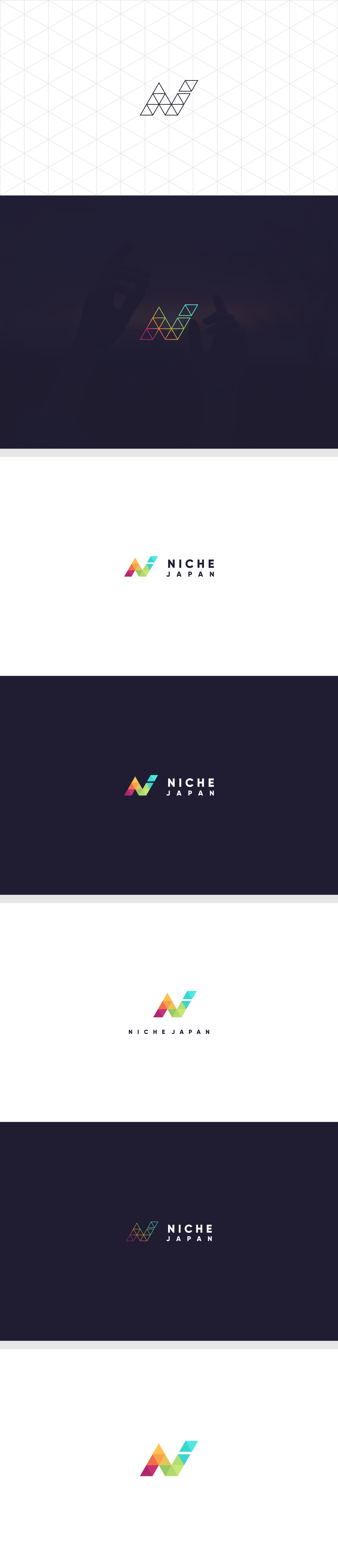
#Description logo:
I made the logo with the initials ''N + J'' with geometric concept, if seen more observant on, the logo forming the letter ''N'' and the letter ''J'' is focused in green and blue colors are deliberately separated. So, I think it can serve as a separator of the letter ''J''.