UniDesign - Interior Solutions

2
Created on 99designs by Vista
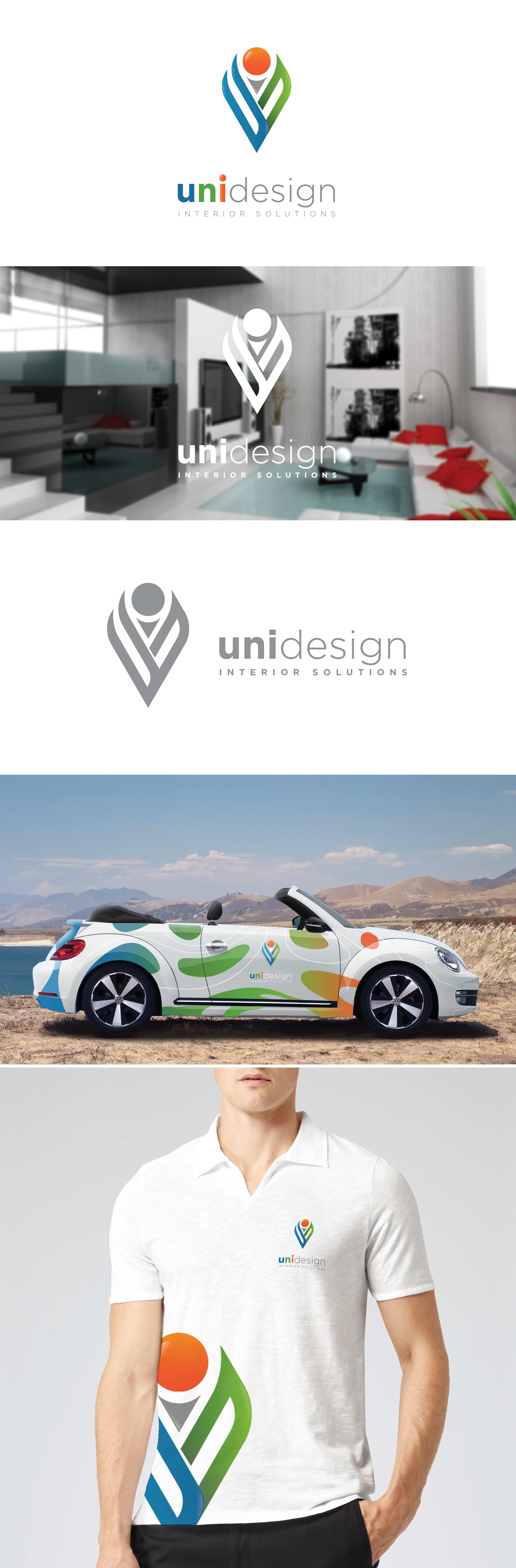
tried to make the conception of the logo simple but with a lot of design and curves. I did the composition of "UNI". As you see in blue the "U" and behind it the "N" in green and simply positioned behind it the "i" with an orange sphere. This logo has a lot of meanings. If you start seeing the details of the logo, you will see a man with two creative hands trying to make something ( the two hands are the "U" in blue and "N" in orange). Second meaning, the "i" standing behind the other letters means inside.. Inside something moderne. The colors chosen are the fresh colors of creativity.