CREATIVE logo for AGENCIAS ESCOFFERY

269
Created on 99designs by Vista
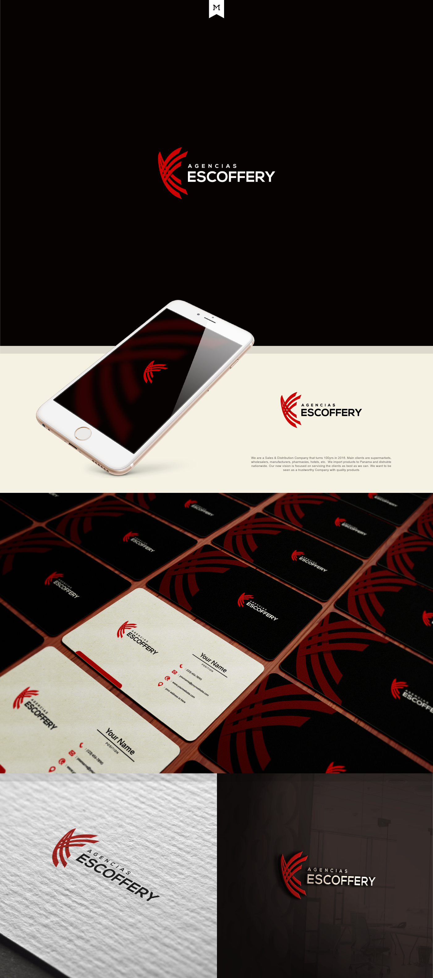
The logo was actually a phoenix bird but CH preferred the head part to be removed so that it would look more abstract and less birdlike. The logo can also be a combination of the company's initial letters A & E but still in an abstract way :) They really love the look and also the meaning behind it. I'm really proud and happy as well, because this was my first platinum contest I have ever won :)
Update:
My logo got featured here :) https://en.99designs.com.mx/blog/creative-inspiration/best-creative-logos/